Password Entry View/Edit Screen

Since this is the “central” screen for managing password it is one of the most important screens.

The challenge is that it’s pretty flexible, and it should be easy to view and edit, and must be usable on mobile and desktop alike.

Terminology

  • File: Every “Password Database” equals to one “File” typically with the file extension .kdbx. Users can open multiple password files.
  • Group: Every File contains at least one Group, but users can create multiple hierarchical groups to categorize their passwords.
  • Entry: Within each Group can be multiple password entries. These are the actual accounts.
  • Field: Every Entry as multiple Fields. A field has a key (label) and a value. For example: a field with the key Username might have a value of [email protected].

Functionality:

  • Basic information:

    • Icon of the entry
    • Location of the entry (Which password file/database, which group)
    • Last modification date
  • Fields

    • there are a few “predefined” fields but these are just suggestions, users can add and remove fields as they please. There are (currently) three different types of fields:
      1. Plain text fields (Name, Website, Username, …)
      2. Protected fields (Password - this is usually obfuscated and users have to click into it to view/edit it)
      3. TOTP (ie. Time-based One Time Passwords)
    • Each field can be “Copied to clipboard” by swiping over a field.
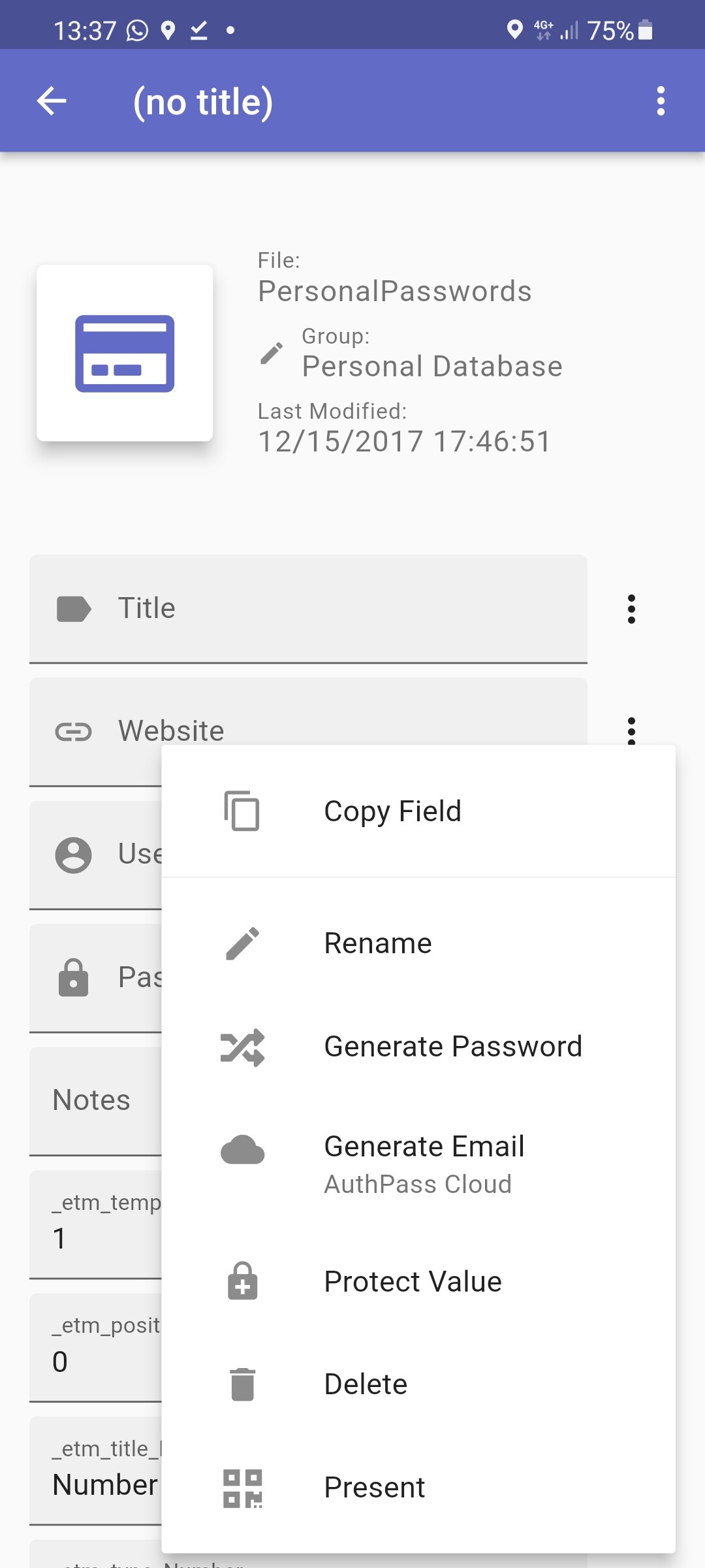
    • Additional Actions in the Context menu for every field:
      • Copy Field
      • Rename (rename the “name” of the field… e.g. “Password” could be renamed to “PIN”)
      • Generate Password: Creates a random string value as password
      • Generate Email: Generates a random AuthPass Cloud email address.
      • Protect Value / Unprotect Value: Essentially toggles between a (obscured) Password field and a plain text field.
      • Delete: Deletes the field from the entry.
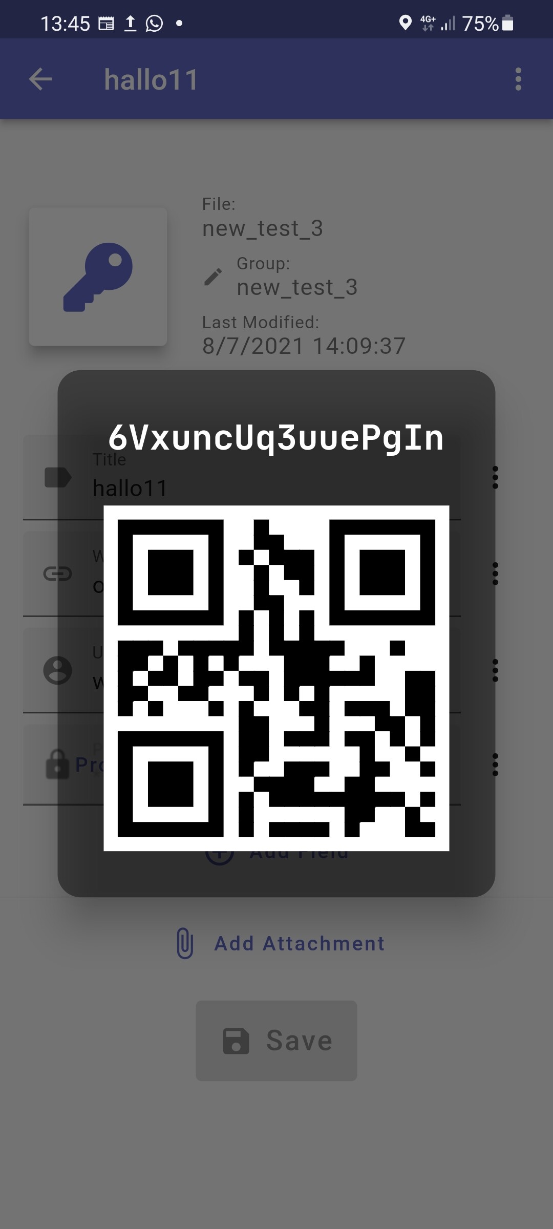
      • Present: Openes a Overlay which displays the value of the field in a readable font as well as a QR code:
  • Attachments

  • History - currently this is not available in the app. When changing a password entry a “history” is kept of all modifications. In the future it should be possible to view those previous versions.

  • Saving of modifications – currently users have to hit Save to apply changes and save the file.

Current Implementation

Currently Edit & View is one unified screen. And I think this is good and desirable. It should be easy to edit passwords, I am not sure if it is worth creating separate view and edit screens. Although I might change my mind if there are good arguments :thinking:

This is how it currently looks:

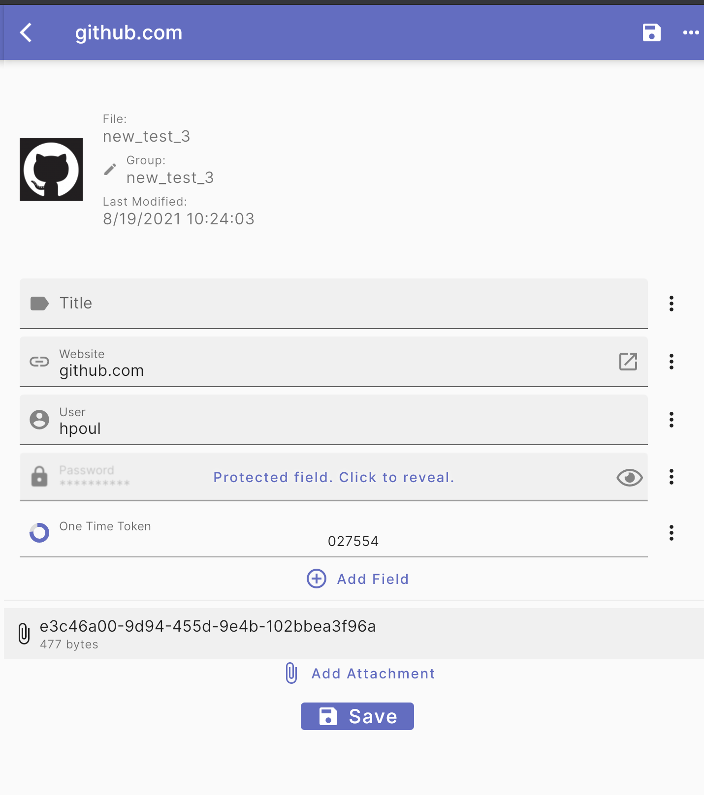
The top includes a short summary - like an icon, the file (ie password database) and group it belongs to, and modification timestamp.

The fields are basically all dynamic. With three types right now - Plain text (title/url/username), “protected fields” (ie. passwords) and one time passwords (TOTP). in addition it’s possible to add attachments. When swiping over a field it’s possible to copy it’s value:

UI / UX Problems

  • The information at the top looks pretty random… And we need a way to integrate the “history view”
  • Not sure if the form is a bit too crowded. maybe need a bit of white space? :thinking:
  • Interaction with the existing fields: Currently when creating a new entry a set of “common fields” are created: Title, Website, User, Password. the ‘Add field’ basically lists the same again… together with “One Time Password” and “Custom Field” … I don’t think this makes sense… at least those fields which are already inside the entry should be hidden. I think this could need a UX overhaul.
1 Like

Hi Herbert,

Thanks for writing this up. You did a good job explaining everything. As for your UX problems:

Problem #1

  • The information at the top looks pretty random… And we need a way to integrate the “history view”

It seems a history of entry revisions hasn’t been implemented in the app yet. If you would like to implement that page, I have two ways to do so.

  1. Make a link to it in the menu next to the ‘password entry’ field. This would take users to a revision history page, and they can easily go back to the current entry page.

That being said, I’m not sure you need the ‘rename’ feature on the three main fields. I understand having them as dynamic is good UX, but those fields will always be required for every password entry you create. It kind of negates the reason for having a ‘custom field’ entry. So, removing the ‘rename’ feature won’t really hurt anyone, and it will save space on the menu for your ‘revision history’ page.

  1. Another easy way to implement the ‘revision history’ page would be to put the link underneath the ‘add attachment’ link. I don’t think it would clutter it up. Revision history is important if people find it difficult to remember former passwords.

Problem #2

  • Not sure if the form is a bit too crowded. maybe need a bit of white space? :thinking:

Yes, this page could use more whitespace between the form fields. It’s most helpful on mobile, but it just lets the page breathe easier in general.

Problem #3

  • Interaction with the existing fields: Currently when creating a new entry a set of “common fields” are created: Title, Website, User, Password. the ‘Add field’ basically lists the same again… together with “One Time Password” and “Custom Field” … I don’t think this makes sense… at least those fields which are already inside the entry should be hidden. I think this could need a UX overhaul.

I think you’re correct on this one. Having the three ‘common fields’ listen again is extremely redundant unless someone has multiple accounts for the same site, or maybe want to list multiple passwords in one entry, which seems unlikely unless you’ve already found a use case for it.

What I would do in this case is replace the ‘add field’ button with a ‘add custom field’ button. Let the UX there be as simple as it needs to be. The ‘One Time Password’ button could be moved, perhaps to the top right where there’s currently a lot of whitespace next to the ‘file: name’ and ‘group:’ area.

Apart from that. I think this page has good UX. It’s easy to understand, even for a first time user like me.

I’m still very curious when you first realized this was an issue. Did a user bring it to your attention, or is this something you just thought of on your own? I think it would be useful to speak with users if any of them find this page to have issues. And, it would be helpful to run a couple of quick usability tests with any changes before you introduce them for implementation.

Please let me know what you think. I look forward to hearing your thoughts!

thanks @anavidauthor for your write up

well it depends how you use it… I guess sometimes you would need: Website, Username, Password - Sometimes it’s: Title, Username, Password - but I can also imagine scenarios where you only need Title, Password (e.g. credit card pins, or access codes to doors/safes/whatever).

(Right now it is not possible to remove those “Common fields” but that’s more of an implementation laziness).

fwiw, I kind of like the implementation of Keeweb which on the main view shows the number of “history entries” and when you click on it, it is basically the same view, but you can page left/right between each revision.

They have a screenshot on their homepage: https://keeweb.info/

Honestly, basically because of my own usage. :sweat_smile: This screen was one of the first things i’ve implemented and I was just in the mode of getting it done, without thinking too much about usability. It has grown quite a bit with piling up on top of it… But before fixing small things I think it might be worth tackling it from the ground up…
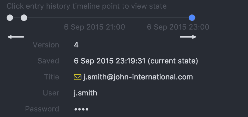
Hi, thanks @hpoul and @anavidauthor to kick start the conversation,

I would like to ask some questions to start with to learn about the context. (may have more later on)

  1. From the Open Source Design platform, you mentioned you did some usability testing, do you have the record or any document by any chance to look into?

  2. When you are talking about wanting to integrate the “history view”, do you observe this from your users? from your competitors? or in what situation to let you think about “history view” is the feature needed to be built? and for what reasons?

  3. When you wrote the ux problems on the top, did you discover the problems from usability testing? or just based on the assumption?

  4. I assume there may not have any user research, but do you have any materials( for ex: user research, competitor research…etc) to look into?

  5. Who is your competitor?

  6. From your recent reply, I assume the ux problems come from your assumptions? If that is the case, I will suggest starting with usability testing before making any decisions and changes.

This is all good stuff guys. Thanks for joining the convo, @bai.

@hpoul Well it depends how you use it… I guess sometimes you would need: Website, Username, Password - Sometimes it’s: Title, Username, Password - but I can also imagine scenarios where you only need Title, Password (e.g. credit card pins, or access codes to doors/safes/whatever).

(Right now it is not possible to remove those “Common fields” but that’s more of an implementation laziness).

That is a good point I didn’t think of, the fact that you can store all kinds of numerical codes that don’t have a website or username attached. So, having the fields there for those entries is unnecessary. Though, if they’re just empty it doesn’t really hurt the UX. It’s just an aesthetic thing.

At this point, I still think removing those options from the ‘add field’ feature doesn’t hurt anyone. Though, it remains to be seen.

fwiw, I kind of like the implementation of Keeweb which on the main view shows the number of “history entries” and when you click on it, it is basically the same view, but you can page left/right between each revision.

They have a screenshot on their homepage : https://keeweb.info/

That’s a cool feature. You can totally take that convention and use it to show historical changes on a separate screen.

Just note that Keeweb is a webapp only right now so it’s pretty much a totally different interface to work with. They have good UX, but as you know it would operate very differently on mobile.

Honestly, basically because of my own usage. :sweat_smile: This screen was one of the first things i’ve implemented and I was just in the mode of getting it done, without thinking too much about usability.

Right now, this seems like the biggest UX problem because you’re trying to implement a new feature.

All that being said, I really agree with @bai here. I’m also curious to see if you have any usability testing or conversations with users. If not, it’s alright. I’m sure we can help with that if you like.

If we can bring some users into the fold, it would help tremendously. A design idiom is that, “we are not our users,” and it’s so true.

Taking tips from competitors is never a bad thing as long as the implementation works for your UX.

Also, @hpoul I emailed you an invitation to a Figma file where I did some initial redesigns. Did you get the invite?

@bai If you like, I can invite you to the Figma file as well. I know it lacks some of the foundational insights from user research, but it may be somewhere to start. It sounds like we need to create a revision history feature, and tidy up how the form fields function.

What do you guys think? I’m always open to hopping on a call.

@zhouslive created a user survey to get feedback from users regarding the password view, maybe somebody could look over it and give suggestions for the survey? I personally have no experience with user research… so would be nice to hear some feedback

Downloaded onto an Android phone

Some errors / bugs I encountered on the Group view:

  • Add field clears the default field of whichever field you select instead of adding a new one (e.g. try to add new ‘Title’ field, existing default title field is cleared
  • Making a field protected with no title entered makes the title display as ProtectedValue{hash}
  • Icons don’t display correctly when viewing a group

Some easy suggestions:

  • Make the triple dot menu contextual for the field, not all fields require ‘Generate Password’ or ‘Present’
  • Allow for re-arrangement of field display order
  • Ask for user confirmation upon deletion of a group (very important!)

Arguments for making separate edit screen for passwords

  • You already are aware of the ease of accidentally changing passwords by making passwords a protected field by default. Putting an edit button in the top right interface would achieve the same result but with more intention from the user. Users should not need to edit their usernames and passwords for an account too often. Less friction for users who want to just view their password, and maybe scroll within a group without fear of changing something they don’t want to. Most design patterns for editing don’t ask for confirmation on exiting without saving, its the default behaviour to exit without saving to offer users an emergency exit from an interaction.

That’s it for now, would wireframing be helpful to the devs? Looking to put this on my portfolio with wireframe visuals maybe.

The online survey I post before was overtime,here is the new link.https://docs.google.com/forms/d/e/1FAIpQLScBSrSYp4ToP9fD3PpqAq81dHAmpdF8zAee1c8I1yrIOniyFA/viewform?usp=sf_link

I redesigned the view/edit pages, here is the figma link.https://www.figma.com/file/hLyYCDEMwuLn6aetwu1kqG/AuthPass-UX-Improvement?node-id=0%3A1
Please tap the “C” on your keyboard to leave me some comments.

1 Like