Since this is the “central” screen for managing password it is one of the most important screens.
The challenge is that it’s pretty flexible, and it should be easy to view and edit, and must be usable on mobile and desktop alike.
Terminology
-
File: Every “Password Database” equals to one “File” typically with the file extension
.kdbx. Users can open multiple password files. - Group: Every File contains at least one Group, but users can create multiple hierarchical groups to categorize their passwords.
- Entry: Within each Group can be multiple password entries. These are the actual accounts.
-
Field: Every Entry as multiple Fields. A field has a key (label) and a value. For example: a field with the key
Usernamemight have a value of[email protected].
Functionality:
-
Basic information:
- Icon of the entry
- Location of the entry (Which password file/database, which group)
- Last modification date
-
Fields
- there are a few “predefined” fields but these are just suggestions, users can add and remove fields as they please. There are (currently) three different types of fields:
- Plain text fields (Name, Website, Username, …)
- Protected fields (Password - this is usually obfuscated and users have to click into it to view/edit it)
- TOTP (ie. Time-based One Time Passwords)
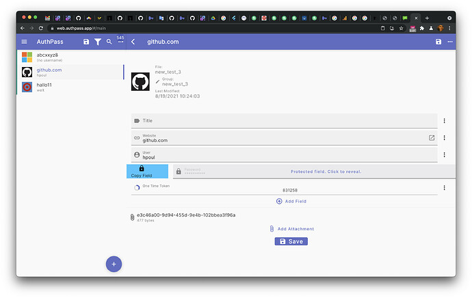
- Each field can be “Copied to clipboard” by swiping over a field.
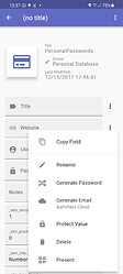
- Additional Actions in the Context menu for every field:
- Copy Field
- Rename (rename the “name” of the field… e.g. “Password” could be renamed to “PIN”)
- Generate Password: Creates a random string value as password
- Generate Email: Generates a random AuthPass Cloud email address.
- Protect Value / Unprotect Value: Essentially toggles between a (obscured) Password field and a plain text field.
- Delete: Deletes the field from the entry.
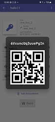
- Present: Openes a Overlay which displays the value of the field in a readable font as well as a QR code:
- there are a few “predefined” fields but these are just suggestions, users can add and remove fields as they please. There are (currently) three different types of fields:
-
Attachments
-
History - currently this is not available in the app. When changing a password entry a “history” is kept of all modifications. In the future it should be possible to view those previous versions.
-
Saving of modifications – currently users have to hit Save to apply changes and save the file.
Current Implementation
Currently Edit & View is one unified screen. And I think this is good and desirable. It should be easy to edit passwords, I am not sure if it is worth creating separate view and edit screens. Although I might change my mind if there are good arguments 
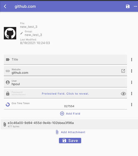
This is how it currently looks:
The top includes a short summary - like an icon, the file (ie password database) and group it belongs to, and modification timestamp.
The fields are basically all dynamic. With three types right now - Plain text (title/url/username), “protected fields” (ie. passwords) and one time passwords (TOTP). in addition it’s possible to add attachments. When swiping over a field it’s possible to copy it’s value:
UI / UX Problems
- The information at the top looks pretty random… And we need a way to integrate the “history view”
- Not sure if the form is a bit too crowded. maybe need a bit of white space?

- Interaction with the existing fields: Currently when creating a new entry a set of “common fields” are created: Title, Website, User, Password. the ‘Add field’ basically lists the same again… together with “One Time Password” and “Custom Field” … I don’t think this makes sense… at least those fields which are already inside the entry should be hidden. I think this could need a UX overhaul.


 This screen was one of the first things i’ve implemented and I was just in the mode of getting it done, without thinking too much about usability. It has grown quite a bit with piling up on top of it… But before fixing small things I think it might be worth tackling it from the ground up…